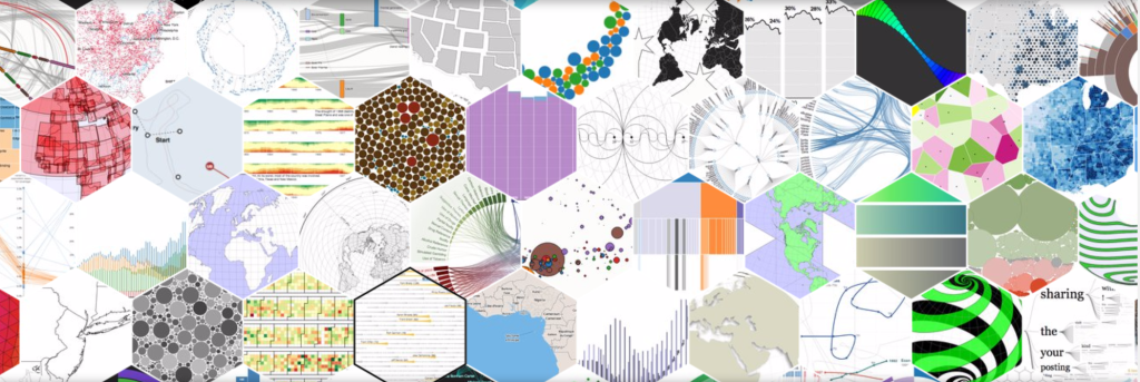
Recently I’ve been looking at the visualization tools that are available on the web, and noticed a distinct difference. A quick Google search shows that I am far from the first person to notice this idea. The basic concept, and what many have found before me, is that visualization’s fall under one of two categories, explanatory and exploratory tools.
Explanatory:
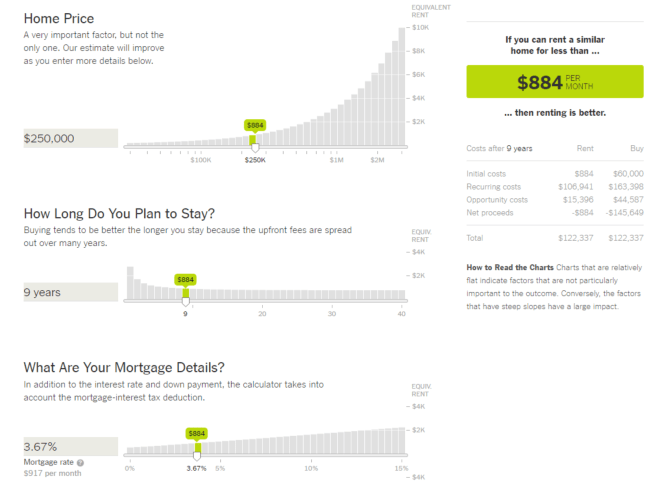
These are the visualizations that are used to illustrate an idea or result in a clear and concise way that removes the need for someone to be 100% familiar with visualization and data. The key? These answer “why” some statement, assertion, or idea is true. The best examples of these are the more advanced and complicated tools that are used to visualize complex ideas that may be hard to explain or illustrate by traditional means.
Exploratory:
Quick and fast to implementation generally. The analyst type visualizations. Think bar charts, simple line graphs…anything that has the goal of showing what is in the specific data set, and doesn’t answer why those data items are in the dataset. These generally answer the “what”. What is happening? Where are high cost goods going? These will be simple to create and illustrate. Think financial dashboards, and simple line and bar charts for the most part.

Why is this distinction important? Being extremely conscientious of what you are trying to do can help select tools, and define what is trying to be accomplished. When this distinction is made on what is trying to be achieved, the right tool and result can be created resulting in time not being wasted
