In the previous blog post we took a look at Chat GPT and it’s capabilities to perform simple analysis on data. For this next article, we’re going to look at using Chat GPT for some more advanced analysis. As we walk through this attempt, all resources used and analysis created will be made available.
The Data Set
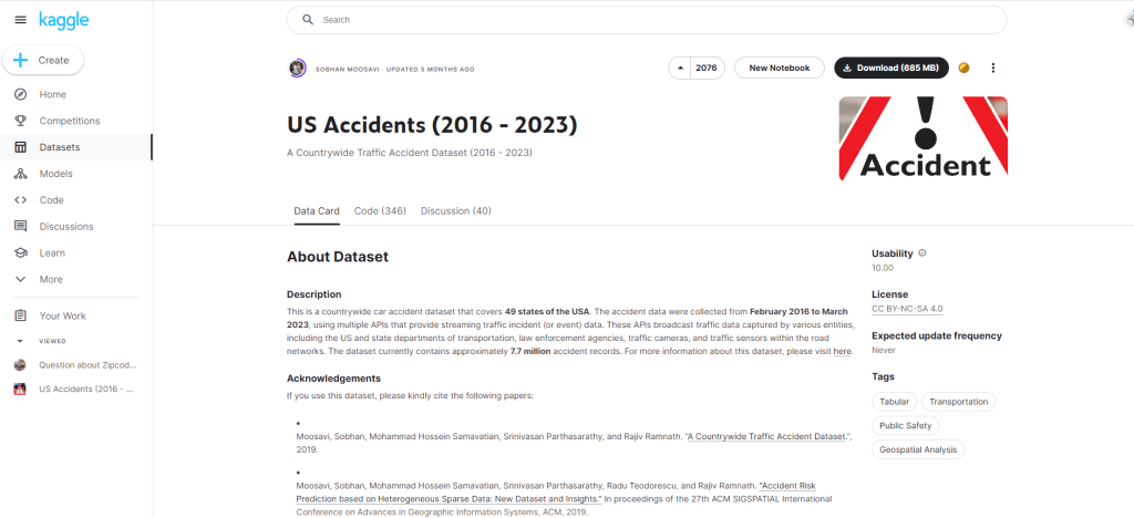
For this analysis we’ll be using a dataset from Kaggle, titled US Accidents (2016-2023) which provides us with a nationwide view of all traffic accidents reported between 2016-2023. All citations can be found at the bottom of this article.
The dataset is a total of 3GB, but for the purpose of this analysis we will be focusing on Texas only data for ease of use.
Hypothesis Being Tested
- 2020 will have a lower total volume of accidents due to Covid.
- Higher volumes of crashes during rush hour in both urban and rural parts of the state.
Hypothesis 1: 2020 will have a lower total volume of accidents due to Covid.
To start of with the descriptive analysis, we begin by loading the data into a Tableau dashboard. The reason for this is that the size of the data is ~3GB, which is too big to handle with straight excel analysis. Plugging into Tableau, we are able to build visuals and a way to extract the data for analysis as necessary.

Tableau and Excel
Looking at the dashboard, we can see 2020 is the third lowest in accidents. This raises the question, why do 2016 and 2023 have such low rates of accidents? What we’ll be looking for is any large gaps/inconsistencies in the data.
My hunch is that there is partial reporting in both 2023 and 2016. To prove this, I’ll pop Tableau back open to add the data into the dashboard for analysis. Below you can see the data with month added in, and the assumption was correct. There is partial data in 2016 and 2023.
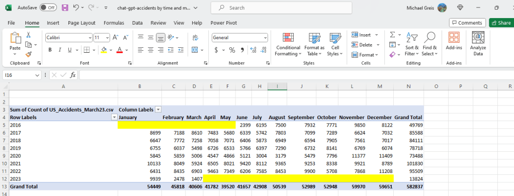
This shows that 2020 did in fact have lower volumes of accidents. Looking at the months when Covid lockdowns were occurring (March-July), we can see that accidents rates were lower than previous and later years suggesting in part that this was due to Covid. In order to prove causation we would have to go a lot more in depth, which is beyond what I’m looking to do right now.
Chat GPT
Plugging in the data that can be found in the “Raw Data” section of the Tableau dashboard, let’s try to enter the prompt and see what it comes up with. The full chat log can be found by clicking here.
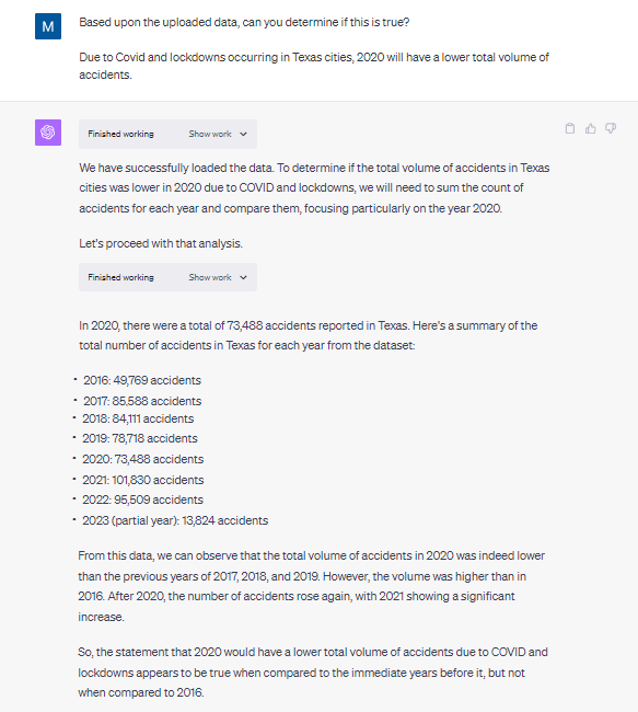
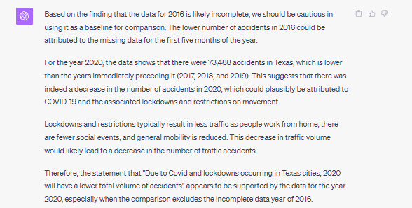
As you can see based upon the above prompt and response, Chat GPT arrived at the same conclusion we did with our Tableau dashboard with about 10% of the effort. No visualization, no pivot table creation and interpretation. Chat GPT did not catch the anomaly in the data however.
When asked to check for anomalies and re-analyze the data, the same conclusion we arrived at in Tableau and excel is generated by Chat GPT.
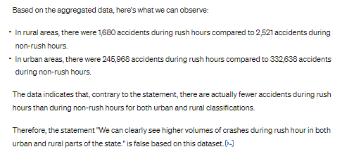
Hypothesis 2: We can clearly see higher volumes of crashes during rush hour in both urban and rural parts of the state.
For the first step in this process we have to identify whether a county is urban and rural. This is not identified in the core data set being used, but is readily available in the US census information. We’ll come up with a rough rule that any county with a 2020 population of less than 50,000 is rural.
Tableau and Excel
Performing this one time analysis in Tableau and Excel was relatively easy.
1. Upload county information to the Tableau dashboard and joined with existing excel data. (~5 minutes)
2. Create LOD and calculated fields to provide the variables (~15 minutes)
- I had to create quite a few calculated fields and an LOD expression to handle the join between the accident data and the county information (different granularity).
3. Saved the data to excel (~2 minutes)
4. Perform the calculation myself using formulas (~5 minutes)
Chat GPT
We start by uploading the two datasets, and having Chat GPT featurize the county information to identify whether a county is urban or rural. After that, it’s as easy as asking the questions and getting the response. The data is already joined together correctly using the county column from both datasets.
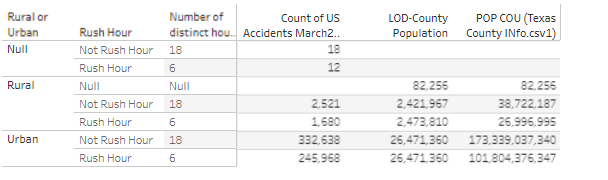
The original response given by the tool is below. Which is too straightforward of an interpretation, as it does not take into account population numbers or the duration of rush hour (6 hours out of the day). We need a different metric than what was provided by Chat GPT.
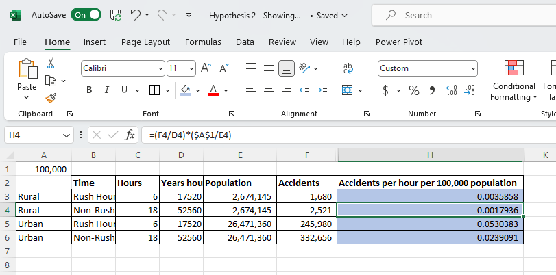
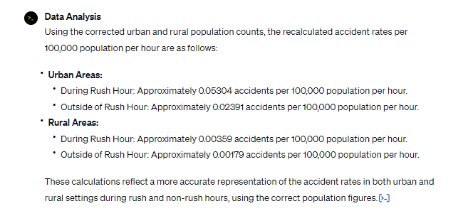
Let’s re-prompt with average accidents per an hour for 100,000 in population.
While this would be a seemingly straightforward request, unfortunately Chat GPT did not perform well. It took about 30 minutes to get Chat GPT to use the right numbers and make the right assumptions. When you compare something like excel with Chat GPT for a simple model where assumptions need to be made, there’s no doubt in my mind that excel is more efficient. In order to troubleshoot Chat GPT and steer towards the correct answers, I had to spin up an excel.
Conclusion:
Chat GPT continues to prove effective for basic exploration of data, and even joining datasets together for more complex analysis. When it came to the assumptions made for the calculation, it did however miss the mark and have to be reinforced multiple times, and in some cases corrected. While we eventually arrived at the right conclusion, I found dealing with these issues in Chat GPT uncomfortable. It was hard to tell how much more time it would take to get Chat GPT corrected due to sometimes having to correct the same issue multiple times.
Appendix
- Tableau
- Kaggle Data Set
- Citations:
- Moosavi, Sobhan, Mohammad Hossein Samavatian, Srinivasan Parthasarathy, and Rajiv Ramnath. “A Countrywide Traffic Accident Dataset.”, 2019.
- Moosavi, Sobhan, Mohammad Hossein Samavatian, Srinivasan Parthasarathy, Radu Teodorescu, and Rajiv Ramnath. “Accident Risk Prediction based on Heterogeneous Sparse Data: New Dataset and Insights.” In proceedings of the 27th ACM SIGSPATIAL International Conference on Advances in Geographic Information Systems, ACM, 2019.
- Citations:
- US Census Dataset
- Chat GPT Log #1 – Correct Answer
- Chat GPT Log #2
