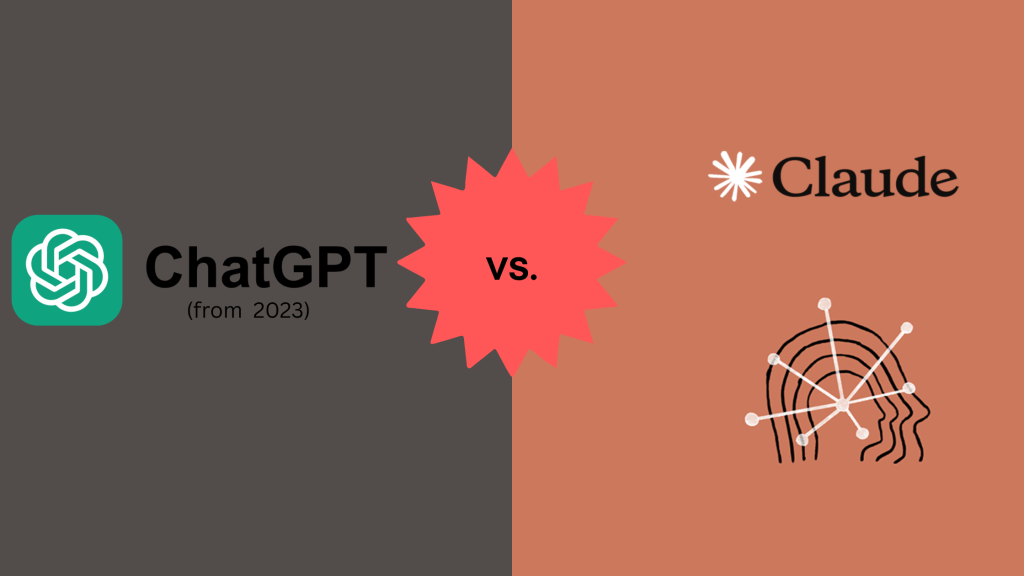
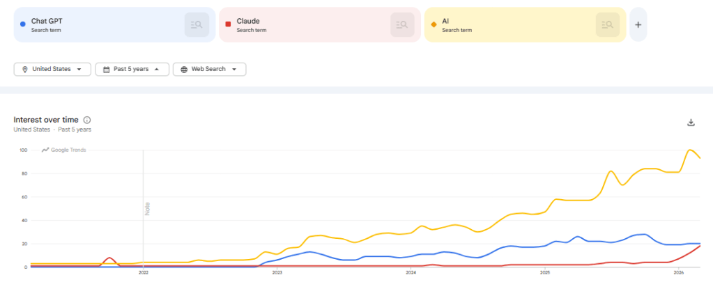
It’s been a long time since I’ve looked at using AI tools for data analysis. Frankly, after playing around with Chat GPT in 2023 it made me skeptical that these tools would be useful in the near term. Thinking back to 2023, we were at the start of the true AI boom. Chat GPT was just released in November of 2022 and entering the public zeitgeist. In the past few years we’ve seen an explosion of AI features in the tools and technologies we use in our personal and professional lives.
In this post we’ll be attempting to use Claude as a data analyst to perform hypothesis testing and analysis, and measuring it against our 2023 Chat GPT Analysis findings.
- Can Claude act as an analyst for us?
- Are the issues we found in 2023’s Chat GPT model resolved?
- How could we use this going forward?
Can Claude perform as an analyst?
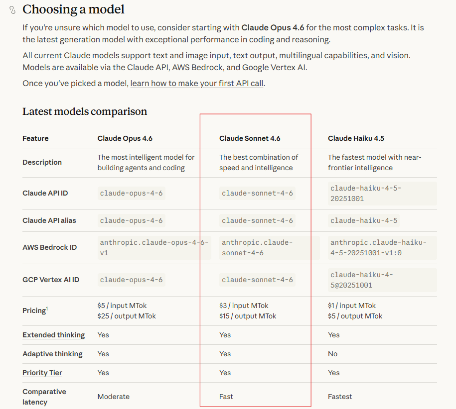
When we looked at Chat GPT for data analysis in 2023 we found it to be quick, but lacking the ability to understand context and detect data quality issues. Let’s see how Claude measures up against the 2023 Chat GPT model. To do this analysis we will be using the free tier of Claude and the Sonnet 4.6 model. This model is listed as “The best combination of speed and intelligence“.
Using the Claude desktop client we’ll now get our hypothesis tested. Using the desktop client you have the ability to upload data to a project, and then query that dataset within the project. The interface is intuitive and extremely straightforward. No tagging or explaining of the dataset was done to produce the output. Just upload the data, and prompt the model.
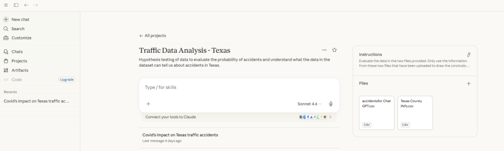
Prompt:
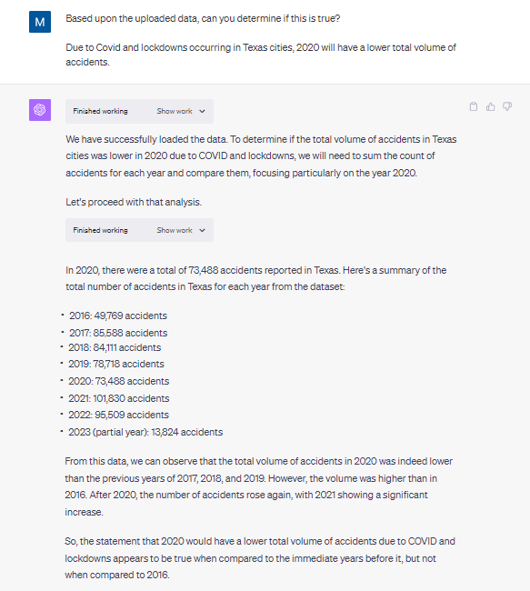
“You are an analyst who has been provided traffic datasets for Texas. These tell us by date and time how many traffic accidents occurred in Texas. I would like you to provide a response that supports or rejects this hypothesis: Traffic accidents were lower in 2020 due to Covid.”
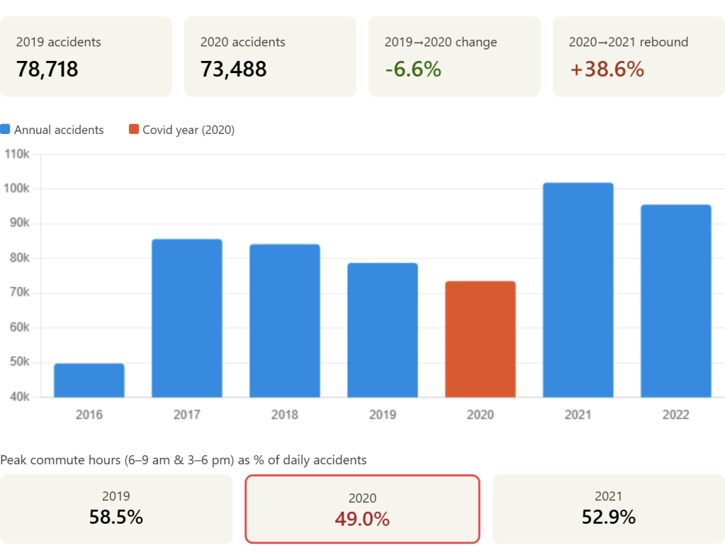
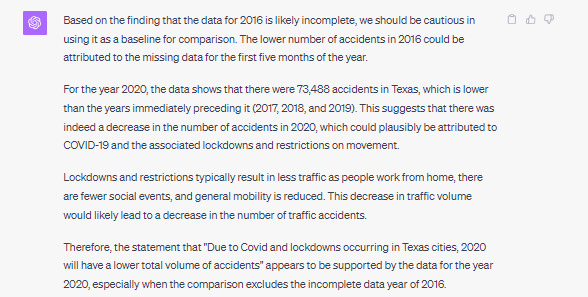
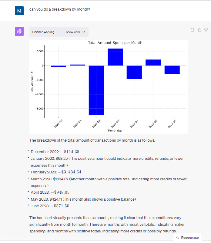
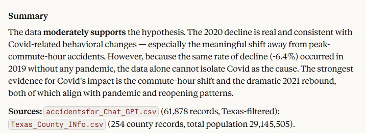
This is a large step up from what I expected to be standard for the model. Not only did it produce a basic visualization, it directly provided KPI’s that would be used to validate the hypothesis.
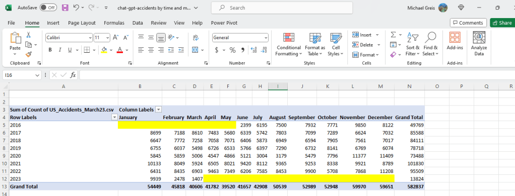
In the details section below, they also provide the more in depth explanation. Not only does it walk me through the data, it also calls out the partial years of 2016 and 2023, removing them from the detailed analysis. Finally, and most importantly, it gives a clear explicit response to the hypothesis and went a level deeper than expected.
- In the full response, detailed explanation of the factors that impact accepting or rejecting the hypothesis.
Conclusion
Can Claude act as an analyst?
Yes. For a basic analysis and hypothesis testing Claude is able to clearly analyze data, provide clarity into how it arrived there, and summarize data.
Are the issues we found in 2023’s Chat GPT model resolved?
The Claude model used for this analysis was clearly better. It caught the anomaly with the partial years of data and excluded them from the conclusion. Claude also gave in depth analysis of data points that both supported and refuted the hypothesis. Also, while not an issue in the original model, the visualization provided as a response to the prompt was useful for framing up KPIs and showing the trend over time.
How could we use this going forward?
The Claude model seems well positioned to be a tool for both experienced analysts doing a first pass of a dataset, and users who aren’t trying to do anything too complex with data. For standalone datasets that are small and generally simple this could expedite the time to insight and enable less data focused users to get valuable insights with the tools they have on hand.