Using Redash for Visualization

Over the winter break I was having a conversation with my cousin concerning the awesomeness of Tableau and all it offers. While Tableau is a best in class product, there are a couple points that he raised which are valid points against the effectiveness of Tableau.

  1. Tableau uses it’s own proprietary language and functions for a lot of aggregations/advanced functionality that could be done in SQL. SQL based tools are better, he referred to Metabase explicitly among others, due to the fact that most analysts know the language and therefore will easily be able to pick it up.
  2. Tableau isn’t open source, so as a user, if something doesn’t exist in an open source tool and I know the language, a custom feature to the tool can be added easily (depending upon your ability to code in the respective language).

With that in mind, that got me down the path of looking at open source reporting and dash boarding tools that are heavily SQL based. When looking, I cracked upon both a Metabase and Redash instance with which to play around with. Metabase had a good number of features available, but an extremely limited amount of rows which could be ingested by the tool on the free tier.

herokutiers

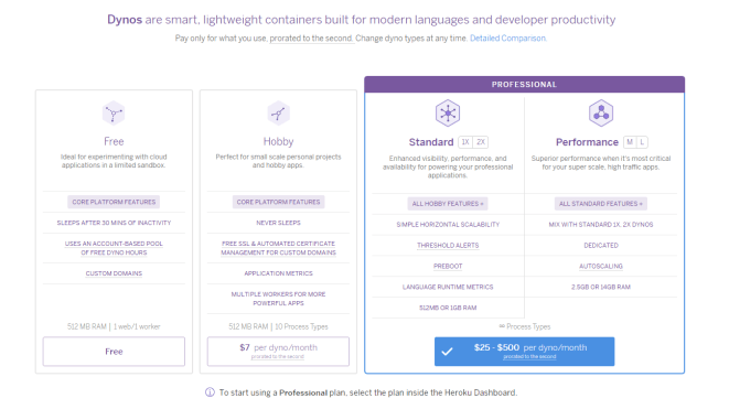
Heroku – Different pricing tiers

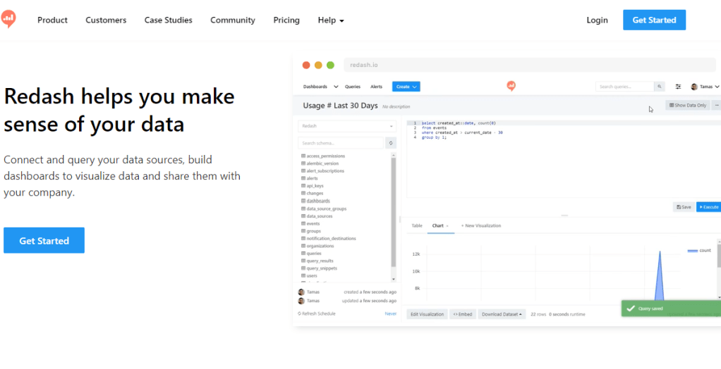
So, not wanting to spend any money upfront, I went over to Redash and started using it to build the first dashboards in the tool using the free trial. Needless to say, I fell in love with the tool instantly then my love was instantly tempered by other limitations present in in Redash. Below is the dashboard that was created, which can no longer be accessed unfortunately due to the free trial period ending, but appeared as pictured below.

redash-dashboard

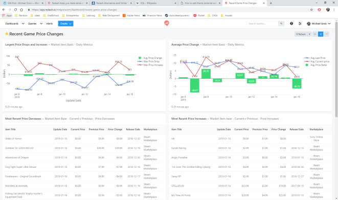
Redash dashboard for Steam and Sony Marketplace price changes

Running through the charts, you can see the game and pricing data that has been collected by my scrapers. Scrolling through the different charts you’ll see the following:

  1. Largest Price Drops and Increases: Shows daily what the maximum price increase has been, and largest decrease has been, along with the average price change for all items which had a price change that day.
  2. Average Price Change: The average price for items which changed price, along with the average previous price for all items in the Steam Marketplace and Sony Play Store which had a price change for the day. In green is average price change between the old price and new price.
  3. Most Recent Price Decreases: The last 20 items which have decreased in price, and associated data.
  4. Most Recent Price Increases: The last 20 items which have increased in price, along with associated data.

At the bottom of each of these panels you’ll see when the data last was refreshed from the database.

Now onto the original reason for writing this article. The pros and cons of using and building dashboards in this tool.

Pros

  1. No row limit encountered on the free trial! What a great feature. The first requirement I had was that I wanted to be able to ingest a large amount of data and do aggregations using that data. Not having a hard row limit that I ran into with my small 40,000 record data-set originally sold me on this tool.
  2. Easy to get up and running. Setting up with tool, and making use of the connectors already present in the tool was extremely easy.
  3. SQL interface is extremely intuitive to anyone who has used SQL Server Management Studio/PgAdmin, or any other database querying GUI tool.
  4. Refreshes are extremely easy to schedule and reliable.

Cons

  1. Free trial, and free software if self hosted. If hosted using Redash.io like I did, the price is $49 a month on the lowest tier. Metabase hosting on Heroku is just as easy, and cheaper to use in the long term for small side projects.
  2. No aggregations can be done within visualizations, which in my view is a must-have with any dash boarding/reporting tool. Redash forces you to push that logic into SQL code, which results in redundant/complex queries. It also forces you to pre-aggregate, so the feature of “No row limit” in the pro’s section no longer applies.
  3. Visualization features are basic/limited. Other dash boarding tools allow you do stacked bars, generally more customization option, tool-tips, choosing color schemes, etc. which are not easily available or are limited compared to a tool like Tableau.
redash-queryeditor

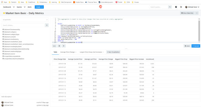
Redash query editor. Combine multiple query visualizations to create a dashboard.

Redash was a tool meant for another use case. Perhaps one where you need a basic tool for monitoring ETL, or some other system…Using Redash was a good experience, but using something like Metabase is the tool for me at the moment. Due to the fact that in Redash all calculations have to be pushed down to the SQL and cannot be done with aggregations in the tool, along with the pricing, it doesn’t seem to suit my use case.

A Foray Into Serious Scraping

It’s been a while since my last post. Getting married, honeymooning, buying a house, etc. took away the time I had for this. But all of that is nearing it’s end, so I’m getting back into the regular cadence of working on the scraping project. Since I’m now back into it, and got everything up and running, I figured the most sensible place to start is the architecture that has been implemented.

The Problem:

The most sensible place to start any discussions of architecture is clearly stating what the system is supposed to do. I need a system that accomplishes these three things.

  1. I need a system that is able to reliably scrape data from any website or consume data from any source.
  2. I need a place where this data can be loaded and reported on in a cohesive format.
  3. I need the product to be lightweight as far as storage space required and CPU so I don’t have to pay out the wazoo.

Overview:

Scraper Architecture

Overview of the architecture, from inputs to database inserts.

In order to meet this, a straightforward architecture was implemented. Using Amazon Web Services both a EC2 instance and RDS instance were set up, with the EC2 being an Ubuntu instance and the RDS being Postgresql. In sequential order, here is how the scraper works.

  1. Using python’s Scrapy library, we’ve written Scrapy projects which look to specific sources to bring in data based upon the HTML on websites. Right now, we’ve targeted two, but can expand to as many as needed. These Scrapy spiders are scheduled through Scrapyd, a framework that no only allows for scheduling and management of spiders, but also offers better performance by operating on Twistd making it asynchronous.
  2. As the spiders are constantly running they are outputting to JSON files on the server. Basically, the driver here is to have a place to drop the output of the data onto the server so that data won’t be lost if something happens with one of the processes.
  3. A Python class was written with Psycopg2 in a way that is meant to be extensible for future data sources. The idea being, that as the data model and data sources are changed/expanded upon, the only thing that will need to change is the class itself. None of the scripts that call the class to insert data from our existing data sources will need to change.
  4. A staging area was created within the RDS PostgreSQL instance which ingests the raw data from the data source. Where possible, a unique index was created that checks for changes before accepting the data into the staging area. As we have scrapers hitting sources repeatedly, we are going to be grabbing the same data. What we’re interested in are the changes, especially in regards to new items or price changes. Also, we want to make as efficient as possible of a architecture so storing only the data we are interested in just makes sense.
  5. Once data has been accepted into the landing zone, the Ubuntu instance is used to schedule a slew of ETL jobs written in SQL and passed to PostgreSQL for execution using Psycopg2. Postgresql doesn’t have a native scheduler readily available, so we use the Crontab functionality of Ubuntu to execute a script for each of our sources that calls from a class containing all of our ETL functions. The end result of this is a 3NF model populated with data and appropriate relationships made.

So, it’s now up and running, and data is flowing through into the objects. The data is populating for all tables where it is expected and I could begin reporting price changes today. The best part? All of this was built using $0’s of infrastructure from Amazon Web Services (and a lot of my time). I’m running out of storage space rapidly (20 gigs from the free tier ran out over a couple days), and the CPU is not beefy at all, so stalls out if more than one scraper is running at a time (as pictured below).

scrapyd-performance

Performance goes down dramatically in yellow. In red, my scraper has been blocked from accessing the site (which didn’t happen before refactor…I’ll go into that another time)

To refer back to the original goal, I would say it has been achieved. Not to say that it couldn’t be improved upon and optimized. But overall, the first serious foray into scraping seems to of gone well. Feel free to reach out with any questions, or suggestions!

What Should Documentation Be?

The problems Business Intelligence organizations solve in organizations are generally the same. Pull some data out of somewhere, synthesize the data, analyze it, then create a picture of what is happening, what is going to happen, or what has happened. Working in small and large organizations, I’ve had the pleasure of seeing a variety of different processes used to deliver these insights. These range from the overbearing, and associated documentation that crush people’s productivity, to the lightweight that creates quicksand beneath teams feet through the lack of knowledge transfer.

Seeing the overbearing and the extremely light weight, there’s one conclusion I’ve arrived at concerning documentation…

Document as Little as Possible


documentation_joke

Relevant literature

Don’t commit time to things that aren’t creating revenue or helping the business. Looking at IT projects, there is no doubt that the more documentation that there is, the less value there is. The perfect example came about when having a beer with a former co-worker.


It was brought up that the process at the company we both previously worked at had documentation that took longer to create then coding, testing, and implementing the change. Additionally, this painstakingly crafted documentation that the engineer had to spend time tracking down information for didn’t result in documents that would be useful to the team doing the work going forward. The process decreed that you must document X, Y, and Z in order to deploy the change/implementation so that’s what was done. The fundamental truth is that the “…benefit of having documentation must be greater than the cost of creating and maintaining it.”

Some people believe in the exact opposite of over documentation. Nothing should be documented. The code/implementation should speak for itself. This may work when you have a small size IT application the will always be managed by the same group of individuals (which likely won’t happen). Once you reach an application spanning multiple servers, teams, and databases the expectation for the code/implementation to “speak for itself” in a timely manner to those who have to report and get analytics out is unreasonable.

So, what’s being proposed in this rant? The only useful documentation that I’ve seen documents the “Why” and the “How”. Everything else doesn’t create value for the organization, as the cost to maintain and develop the documentation is too high.

Why

Creating a BI Product entails connecting the business process to an application(s) or database(s). Depending on the environment that you’re working in, Inmon, Kimball, or something else entirely, you need to know the answer to why things in your system exist. The “Why” is important not only from a high leadership level, but also at a low technical implementation level. The “Why” statement done at the low level helps to ensure that a team is using previously created tools and implementations as designed. And if a change is made that goes against the original “Why”, it is intentional and by design.

As an example, working on the Vehicle Profitability by VIN project, the Data Architect created both Inmon (3-NF) and Kimball (dimensional reporting) structures on the project. The “Why” was made extremely apparent through documentation, so the teams knew how to use the current implementation to achieve their goal in the best way possible.

Are you importing new invoice data? That should go into the wholesale invoice structure so that it flows up in the existing fact that contains the revenue information for vehicles which our reports feed from. Why? Because we want a single source of truth for vehicle revenue.

When documentation providing the “Why” for technical implementations exists, it makes adding on and changing the existing processes and assets easier. As opposed to re-inventing the wheel over and over.

How

Payment-Data-Flow-Diagram

basic data flow diagram

So after we know why something exists, the other piece that is useful for documentation is the “How”. The “How” shouldn’t be step by step instructions, it should function like a high level map. Data Flow Diagrams are a great example of “How” documentation that I’ve found useful for Business Intelligence products. Armed with the Data Flow Diagram and the “Why” of the design, team members who need to report on, extend, maintain, or refactor a system will be able to make informed decisions.


Make It Useful

At the end of the day, documentation gets in the way of creating code/analysis/direct business value. So the argument for spending time creating documentation is hard to make when someone hasn’t experienced the pains associated with lack of documentation. Lack of architecture that makes sense, misreported numbers, time wasted building processes that do exactly what existing processes already do.

Without documentation, maintaining and using a system or process as intended is impossible. With documentation that is accessible, searchable, and focuses on the “How” and “Why”, organizations can make smart and informed decisions of where to spend time, how to tweak things, and how to get value from their assets.


Data Day Texas 2017 – A Few Thoughts

Earlier this month I had the opportunity to attend Data Day Texas, and thought that it would be worthwhile to jot down a few thoughts. For those that aren’t aware of Data Day Texas, think of it as a gathering of nerdy IT people and Data Scientists. It was an interesting weekend with a wide range of topics that encompassed everything from machine learning algorithms to more approachable subjects like data dashboarding.

Graphs Are Here

There’s a reason that the keynote by Emil Eifrem was named “The Year of the Graph”. Looking at the popularity trend on db-engines.com, you can see a large gain in the

neo4j-popularity

Neo4j Popularity

popularity of Neo4j. Leading naturally to the question, so what?

I think the major winning point for graph databases, other than performance on certain types of data analytics, is that graph databases are defined with relationships between data. This is in opposition to the approach of the traditional RDBMS which requires explicitly defining the tables in the schema, with relationships as a non-required afterthought in most cases. This means that while constructing the database, what you are doing is explicitly defining the node (core piece of data) and the edge (relationship between nodes). This means that you are enforcing the relationships between data, as opposed to the structure of the data itself. This creates another level of abstraction between the end user and the data, which should make the data in the database more approachable. Oh, and if you haven’t guessed, graph databases are schema-less which is a plus in many cases.

Issues Are Similiar Across Companies/Technology

In particular, there were two talks that hit this point home. The first was given by Chris LaCava from Expero Inc. in which he discussed visualization techniques with graph databases. The second was the discussion of how Stitch Fix sets up their environment for data scientists to work by Stefan Krawczyk.

What’s the root of this? People want to use the tools that work and that they like. Chris LaCava discussed how to do visualization on graph databases. While graph databases can

dashboarding-design-process

Look familiar? From Chris’ presentation on graph database dashboarding

meet some cool use cases as far as data sets and real time analytics go, what was discussed was a  straight forward and common sense approach to dashboarding. Anyone familiar with Business Intelligence and dashboarding should roughly be following the above, or near to it.

Stefan‘s talk was all about using Docker to enable data scientists to use the tools that they want to use. The solution to the complaint that many of us in the industry have when we are locked in with a specific tool-set. The differentiation here was that Stitch Fix has done containerization at scale. This solves that problem by allowing each of their data scientists to run and operate on their own environment, with whatever tool-set they favor to deliver business value.

The Story is What Makes Things Interesting

The final point, which I’ve written about before, is that the story is what makes things interesting. The specific story presented at Data Day? The Panama Papers and how Neo4j was used to discover the unlikely connection that led to the downfall of a Prime Minister. That this was the best marketing tool that I have ever seen in regards to a database.
Having a database GUI that allows for easy exploration of the data natively? That’s a game changer.

This slideshow requires JavaScript.

Looking at the above, you can see a traditional RDBMS GUI (SQL Server Management Studio) versus Neo4j’s GUI. There’s a reason why people don’t pull up SQL Server Management Studio tools to tell a story. Having a database platform that can automatically tell a story about the data is an awesome approach.